Four Products.
Four Audiences.
One Engagement.
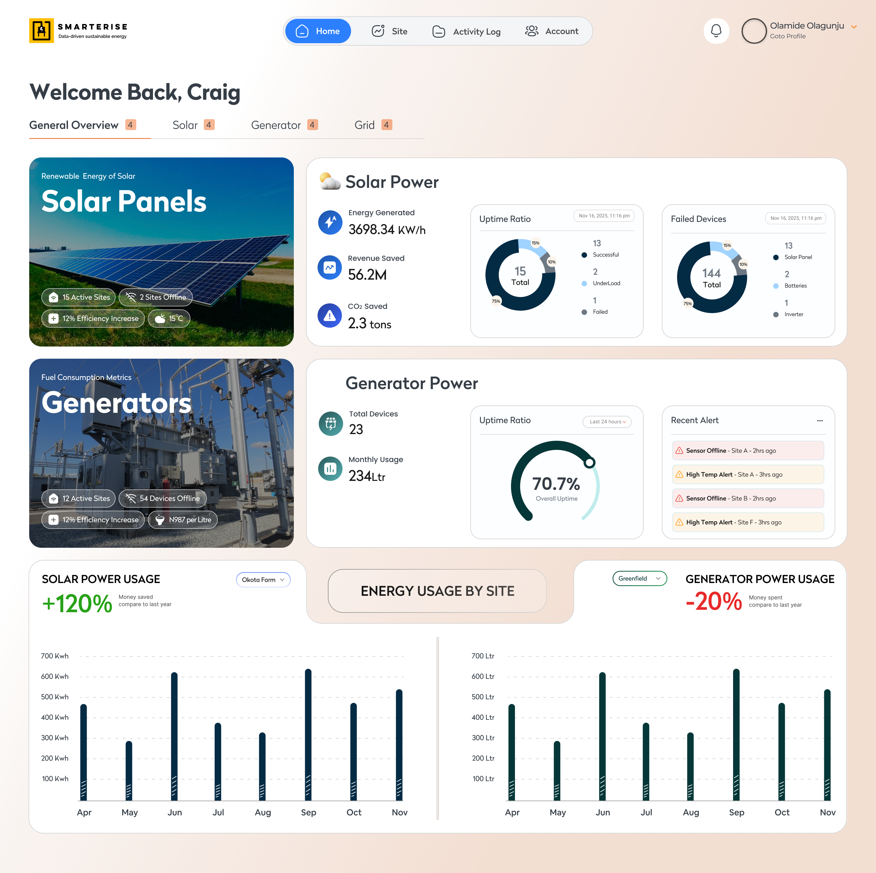
As Senior Product Designer (Consultant) at Prunedge, I led visual design across four concurrent client products, from a banking portal used by millions of Nigerians to community platforms serving women in tech and government digital skills programmes.
One consulting contract.
Four live products.
Prunedge is a Nigerian technology consultancy delivering digital products for enterprise and public sector clients. During my engagement as Senior Design Consultant, I worked across four active client projects simultaneously, each at a different stage, for a different organisation, serving a different audience.
The anchor project was the Stanbic IBTC Quick Service Portal: a full redesign of an existing banking platform serving millions. I co-owned the visual design direction alongside a fellow Senior Designer, with screen ownership clearly divided between us by product area.
Redesigning a Banking Portal
Millions Already Trusted.
Improve what already works.
The Quick Service Portal existed. It worked, and millions of customers used it. The brief was not to reinvent it but to improve it: better visual hierarchy, cleaner forms, more consistent experience, all within the boundaries the board had defined.
The board defined the guardrails.
Stanbic IBTC's leadership had clear directives: forms should feel familiar: traditional bank patterns existing customers already knew. Modern UI innovation was not the goal. Clarity and reliability were.
No single user profile exists.
Millions of Nigerians across every age group and digital literacy level use this portal. The design had to be immediately legible to a 22-year-old and a 68-year-old equally.
Two senior designers. Clear ownership.
Both designers held Senior level. Screens were divided by product area, not by seniority. I owned visual design direction across account management, transactions, service requests, and banking services.
How the work got done.
Audit & Discovery
Before any new design, I mapped every key existing flow: login, account overview, transactions, service requests, card management, documenting friction points and visual inconsistencies throughout.
Brief Interpretation
The board directives were not restrictions to work around. They were the design brief. Understanding what "familiar and trustworthy" means to a Nigerian bank customer shaped every layout, form pattern, and navigation decision.
Visual Design Execution
Working from the Stanbic IBTC brand system, I applied consistent visual language across my owned screens: improved information hierarchy on account overviews, clearer form states on service requests, better visual feedback on transaction flows.
Review & Iteration
Design reviews involved Prunedge stakeholders and Stanbic IBTC institutional feedback. Multiple iterations refined spacing, label clarity, error states, and form interaction patterns before final handoff to development.
Five decisions that
shaped the redesign.
Familiar over modern.
The strongest decision was accepting the constraint. Traditional form patterns were kept deliberately, because millions of customers already knew them. Improvement came through visual hierarchy, not reinvention.
Labels before icons.
In a platform used across all digital literacy levels, text labels were prioritised over icon-only navigation. An icon means different things to different users. A label does not.
Error states as first-class design.
Banking forms fail: wrong account numbers, expired cards, invalid amounts. Error states were designed with the same care as success states: specific language, clear recovery paths, no generic messages.
Consistency over creativity.
In a co-design context with divided ownership, visual consistency required explicit shared rules: spacing tokens, colour application, component patterns, not assumptions or good intentions.
Trust through restraint.
Banking customers do not want to be surprised by their bank's interface. Every decorative element that created noise without informational value was removed. Reliable means familiar, predictable, and calm.
This project was delivered under a commercial consulting agreement between Prunedge and Stanbic IBTC. Original design files remain the property of the client engagement and cannot be publicly shared.
The portal shown above is publicly accessible at ibanking.stanbicibtcbank.com, a live, deployed banking product used daily by millions of Nigerian banking customers across every demographic.
This design is live. Millions use it.Other platforms delivered.
During the same consulting period I contributed as Senior Design Consultant to three additional Prunedge client products.

Nigeria's leading women-in-tech training programme, 124,000+ women empowered across 5 African countries.
Non-disclosure agreementBritish Council–led digital skills programme delivering training to Nigerian citizens at national scale.
Non-disclosure agreement
National Talent Export Programme: Nigeria's federal agency for services and talent export under the Ministry of Industry, Trade and Investment.
Non-disclosure agreementThree things consulting taught me
that client work never does.
Institutional constraints are a design brief, not an obstacle. The board's conservatism was not a failure of vision; it was a statement about who the users are and what they need from their bank.
Co-design requires explicit rules, not good intentions. Two senior designers can produce inconsistent work without shared tokens, patterns, and review criteria agreed in advance.
Millions of users means millions of contexts. Designing at this scale means every decision serves the widest possible range, not a single persona.
Interested in how I approach product work?
Book a 20-min intro call, or send the role details by email.