The Grid Was Only
Part of
the Picture.
Smarterise commissioned a complete redesign of their enterprise energy management platform, built for Total Energies' 24-site portfolio across Nigeria and France. As sole Product Designer, I led design thinking from discovery to delivery: unifying three energy sources (grid, generator, and solar) into one coherent dashboard deployed to one of West Africa's largest energy operators.
From fleet overview to
site-level diagnostics.
Five screens, one platform: overview, source dashboards, and per-site diagnostics.
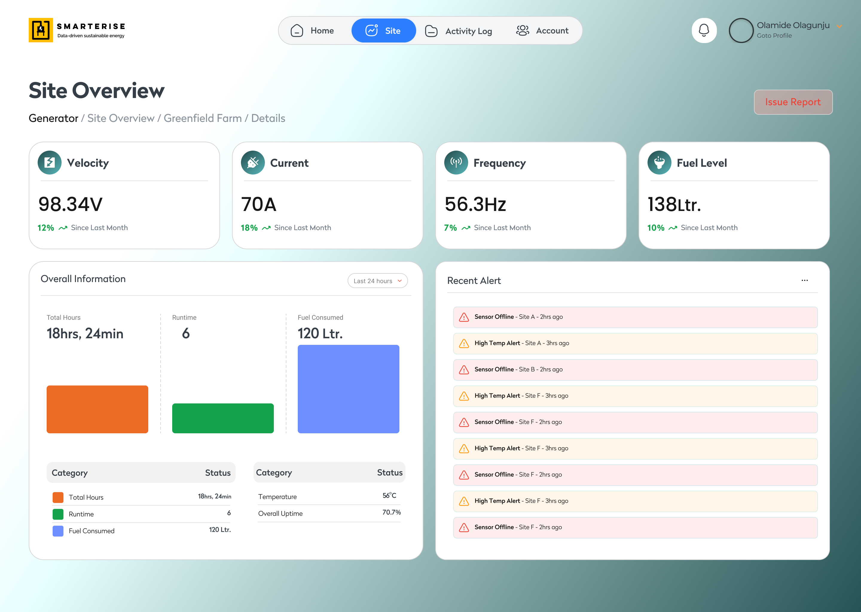
Industrial-scale energy visibility for Nigeria's largest commercial operators.
An enterprise energy management platform built to unify data from three power sources (grid, generator, and solar) across multi-site industrial portfolios operated by large-scale energy companies in Nigeria and France.
Before this platform, each energy source lived in a separate system. Operators had partial visibility at best, with no way to correlate generation, consumption, costs, and carbon output across their entire portfolio.
Smarterise brought me in as sole Product Designer to lead design thinking from discovery through delivery, defining the information architecture, data hierarchy, and visual language for a platform their enterprise clients would stake operational decisions on.
Two of three energy sources
were completely invisible.
Six visibility gaps existed before a single screen was drawn.
Generator performance was untracked
Fuel consumption, runtime hours, and efficiency metrics had no data home. Operators were flying blind on their most expensive energy source.
Solar output was invisible
Solar generation existed in a separate system with no connection to overall consumption. Renewable contribution could not be measured or reported.
No fleet-to-site drill path
An operations manager seeing a fleet-level alert had no way to navigate to the affected site's detailed readings. Both data levels lived at the same abstraction.
No financial or ESG reporting
CO₂ offset, energy cost savings, and cross-source cost attribution were invisible. Enterprise clients could not report on their renewable investment.
Site management didn't scale
Adding or reviewing sites was fully manual. At 24 sites this was workable. At the 200-site growth trajectory, it would collapse.
KPIs had no logical structure
Performance indicators were scattered with no hierarchy. There was no way to tell at a glance which sites needed attention and why.
Designed for authority.
Built for instant clarity.
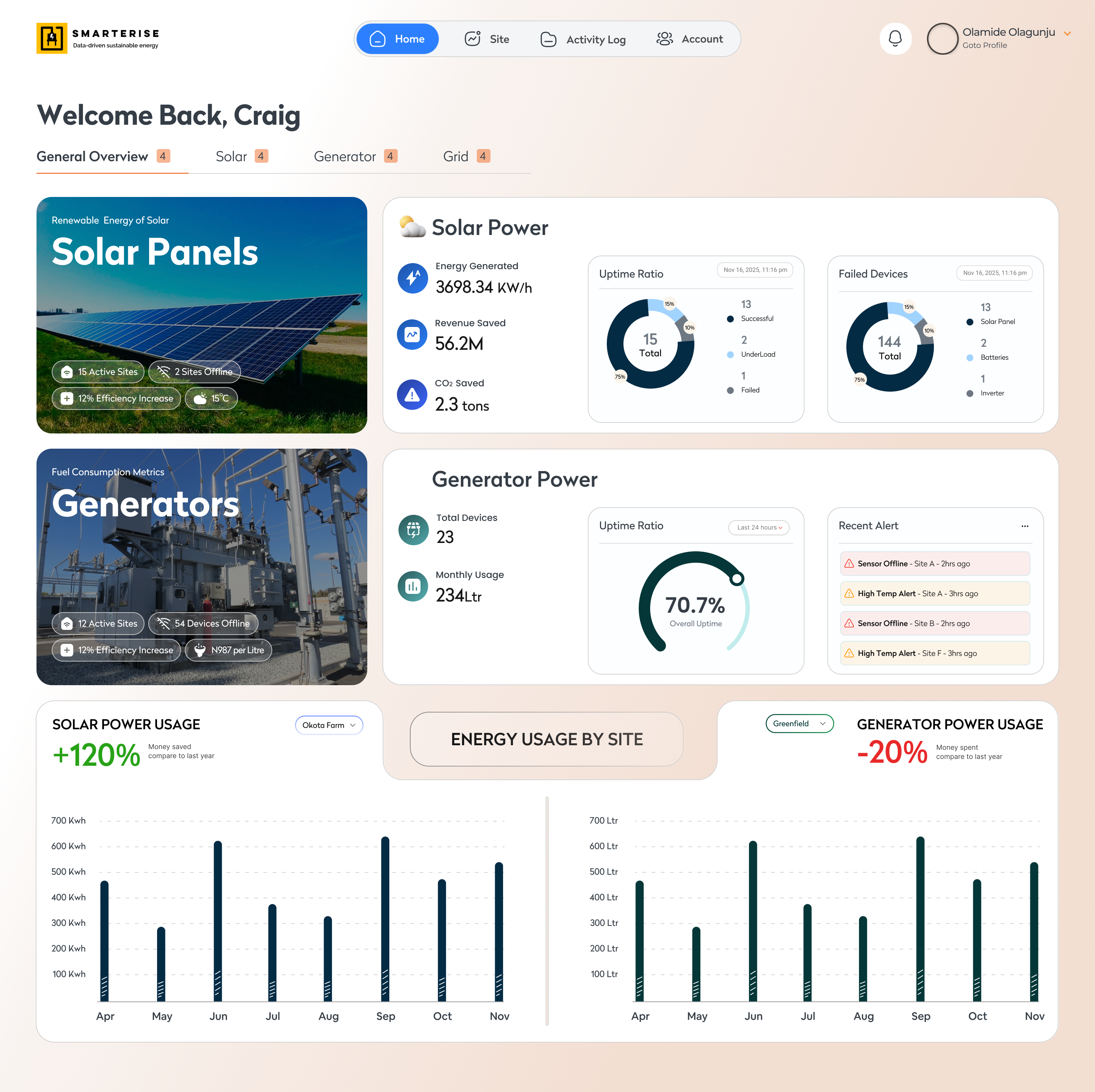
This is the highest-access view in the platform — used by senior operations managers and enterprise clients overseeing the entire site portfolio. Every data point, site status, and cross-source metric visible from a single screen.
Designed for users who need to make high-stakes decisions fast — with no time to navigate through multiple views to find what they need.
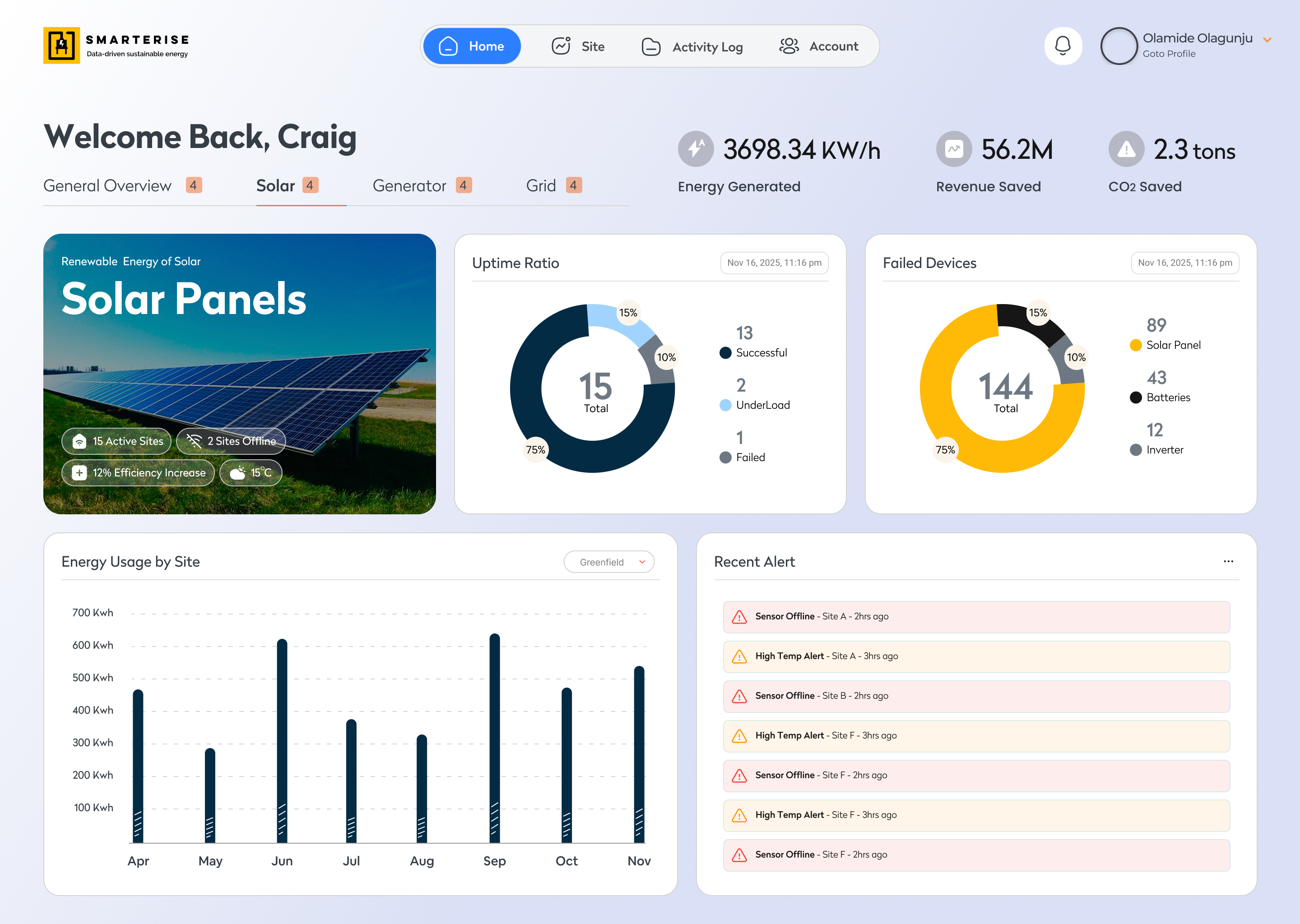
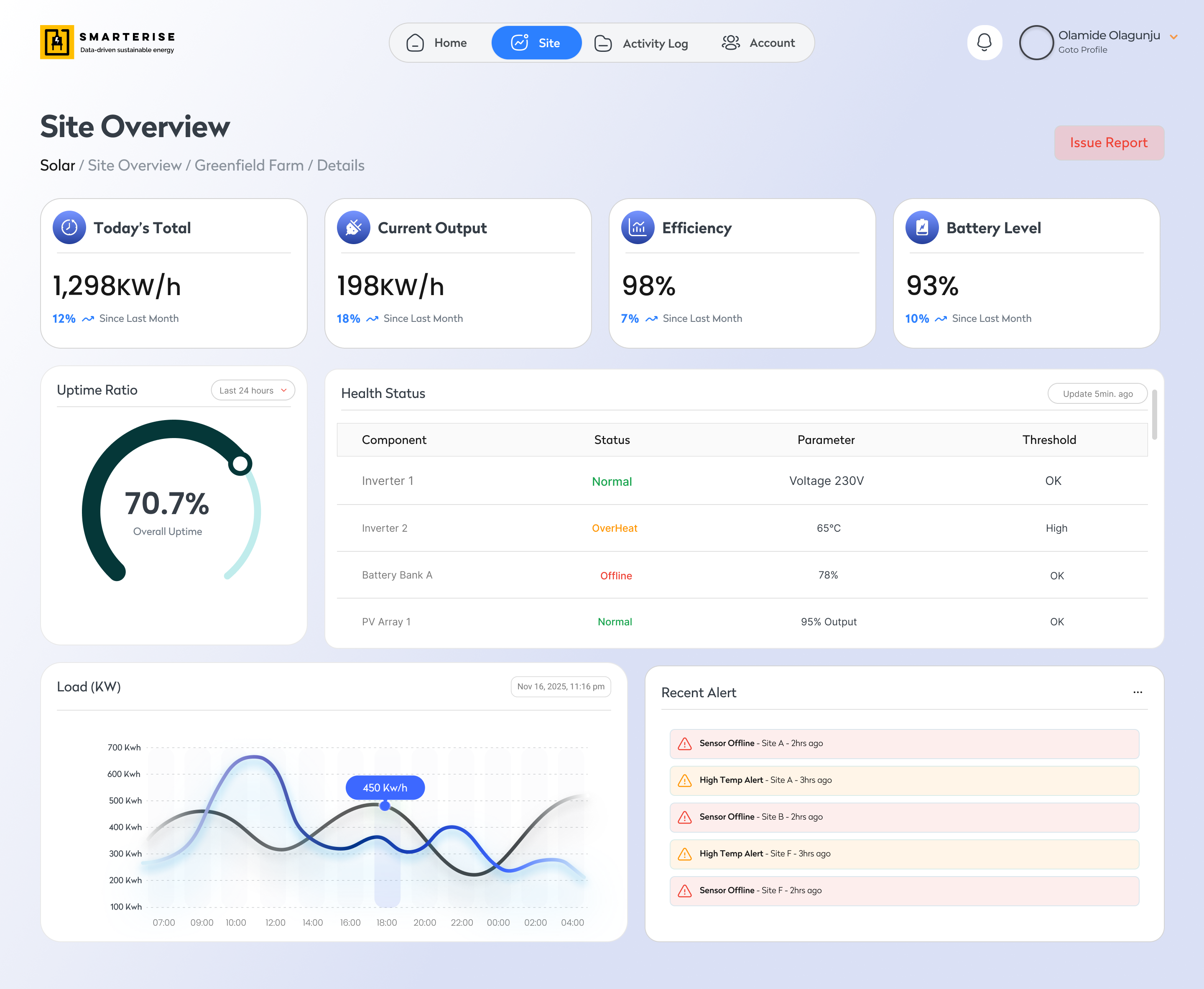
Fleet-level solar output, efficiency, and environmental impact.
Energy generated, CO₂ offset, revenue saved, and comparative output charts across all solar-equipped sites.
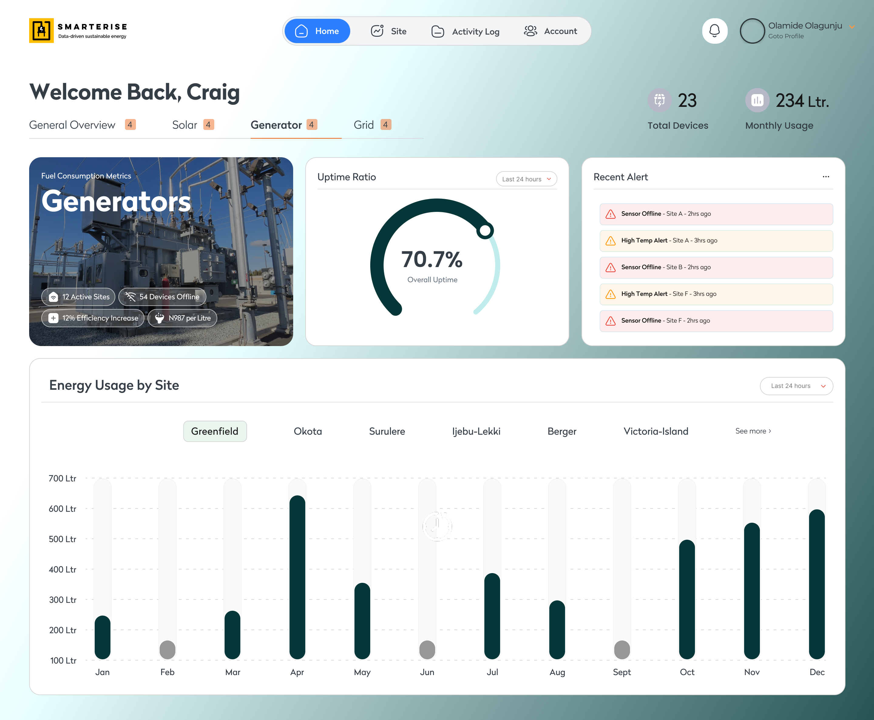
Fleet-level generator uptime, fuel consumption, and site comparison.
Uptime ratios, fuel trends, recent generator alerts, and cross-site energy usage in one fleet view.
Every site, its status, and its energy source — one searchable table.
Filterable site list built to scale from 24 to hundreds, with per-site drill-down into source-specific readings.
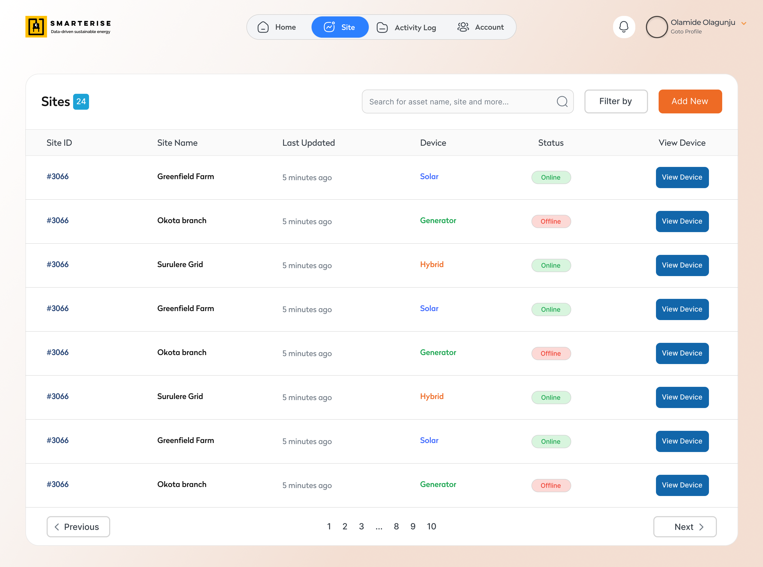
Site list with energy source type, status indicators, and search — designed to scale without a redesign
Solar site: today's output, efficiency, battery level, uptime ratio, and health status
One site. Multiple energy sources. One unified view.
A distinct interface for sites running Grid, Generator, and Solar simultaneously — all sources in one combined dashboard with tab navigation between them.
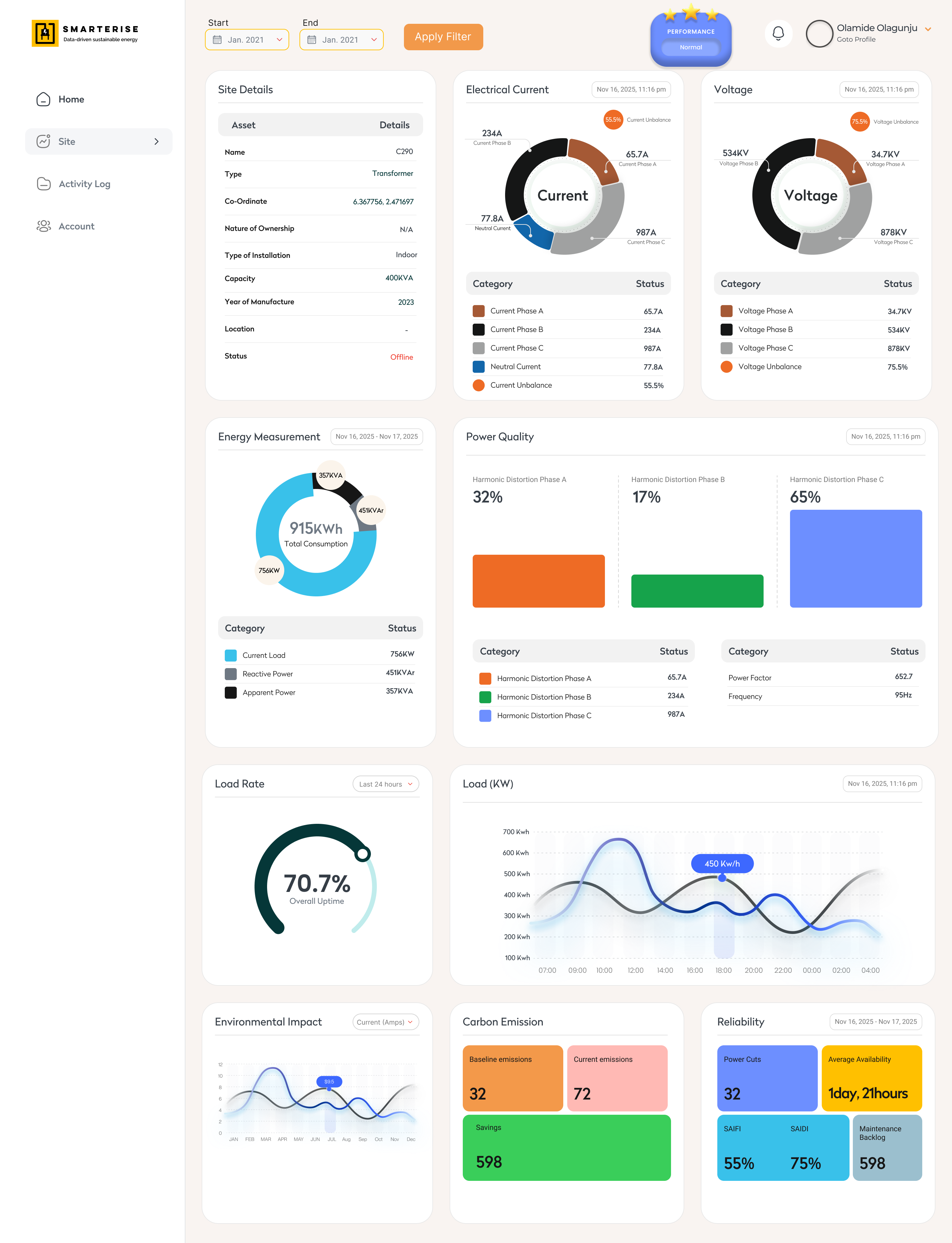
Combined site dashboard: unified summary metrics at the top, with tab navigation for switching between each energy source's detailed readings without losing site context
The brief became
the blueprint.
The scope of work wasn't just a project brief — it became the information architecture. Every KPI category, data hierarchy decision, and navigation pattern in the final designs traces directly back to questions asked and answered during discovery. The client described what their operators needed to know. I translated that into what they needed to see — and where, and when, and at what level of detail.
How the platform thinks.
Before any screen was designed, this hierarchy defined what information lives where — and how an operator moves through it.
Certain screens from this project — including access control interfaces, administrative configuration views, and client-specific data dashboards — are protected by a Non-Disclosure Agreement and cannot be displayed publicly. The designs shown in this case study represent the publicly shareable portion of the work.
The platform has been deployed to and actively used by large-scale energy operators including Total Energies and FMCG manufacturing companies that manage significant energy consumption across multiple production sites. These are organisations where energy visibility directly impacts operational costs, sustainability reporting, and industrial output.
The designs you see above are live. They are in use today.Four principles
this project proved.
Data hierarchy IS the design. The IA work — deciding what lives at each level — was more important than any visual decision.
Designing for Gen X and Boomer users means choosing clarity over aesthetics. Every chart type and label earned its place through functional purpose.
A second client engagement is the highest form of design feedback. They came back. The first phase worked.
Chart types are product decisions, not style choices. A line chart vs a bar chart changes what a user can conclude from the same data.
Interested in how I approach product work?
Book a 20-min intro call, or send the role details by email.